It’s a shame we need to spend so much on such deep studies to prove what’s obvious to anyone who’s ever lived on the breadline.
social democracy ftw

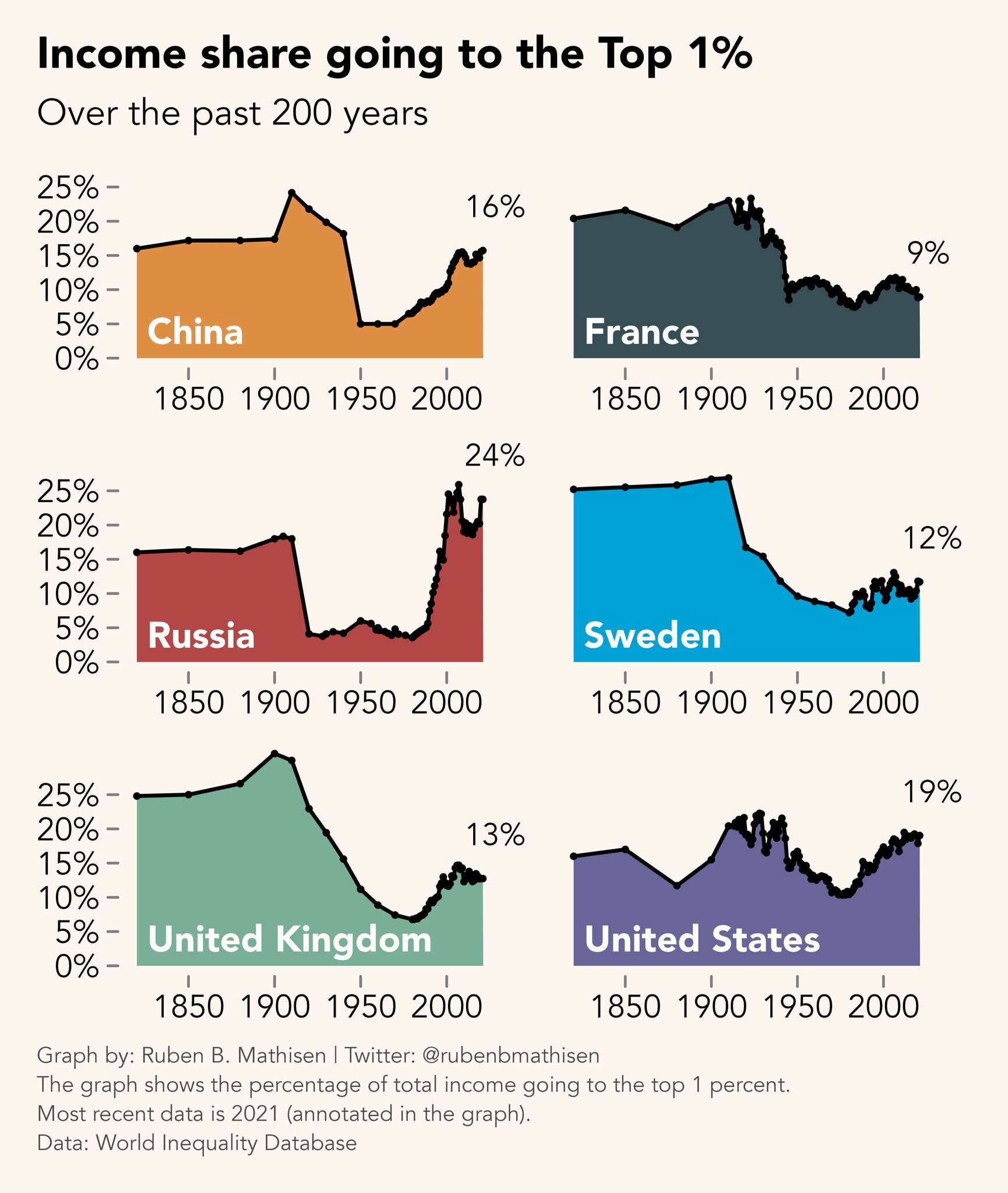
Just remember, as someone else mentioned when this graph was posted on Reddit, that this is income and not wealth share. The wealth gap is much, much larger for every country pictured here, and the income difference compounds into a wealth difference abyss over time.
Yes, but people get paid income in wages, so it is still relevant. That some of them turn income into appreciating assets, or wealth, is a separate issue.
Sure, I’m not arguing against the graph or that it is relevant. Just a friendly (dystopian) reminder that the top 1% of income earners don’t really rely on income. They make most of their money investing capital or company profits in ways where they can avoid paying income tax.
Yeah, it’s just interesting to see income for once, the wealth disparity is often discussed.
I’m firmly in favour of a Robin Hood tax to make asset wealth pay its way


