I like pure red light (#FF0000) because its relaxing and lessens visual information overload
Baker-Miller pink is also interesting, was proposed to reduce violence and promote calmness in prison. Also very relaxing
Because it’s metal as fuck, that’s why. Electromagnetic equivalent of a sonic boom.
Also, it’s pretty:

In terms of physiology, the color is stimulated in the brain when the eye reports input from short wave blue cone cells along with a sub-sensitivity of the long wave cones which respond secondarily to that same deep blue color, but with little or no input from the middle wave cones. The brain interprets that combination as some hue of magenta or purple, depending on the relative strengths of the cone responses.
In other words, our brains are like “🤷♂️, here’s a thing”
And you can pronounce it “foof”!
490-510 nanometers, I love cyans and greens. Teal and turquoise are very relaxing colors to me 😃
LOL, you would love my house and decorations. Also, this.
Ultraviolet.
IE a black light. It’s the only light that makes pigments even cooler.
I’m a fan of synthwave. AKA Outrun. Colors from that pallette on a black background are my jam. If I have to pick one, I’d go with neon purple.
I like #B00B69. Not only for the name, but also because it’s a really nice magenta color
Color app says “Lipstick”
Ultraviolet. It makes other colors that much more cool just by being there. And it kills things.
The one positive to wearing contacts all the time is that my eyes are mostly protected from UV. I always think how cool that is even if I still avoid looking directly at UV lights out of caution.
#FDEFCD
I like me some good candlelight-like yellow.
What I call Parrish light - the distinctive tone that’s prominent in Maxfield Parrish’s paintings.
It’s a relatively subdued but clear reddish orange that I see most commonly with relatively uniform but thin thunderclouds at dusk. It makes blues and greens much more vivid, in spite of the fact that the overall amount of light is relatively low. And it’s glorious.
investigates
This painting of his – Daybreak – has a pale red-orange and has blues and greens that sort of jump out more because of that, I suppose. Is this what you’re referring to?

Daybreak, inspired by the landscape of Vermont and New Hampshire to create lush and romantic tones,[1] is regarded as the most popular art print of the 20th century, based on number of prints made: one for every four American homes.
The technique of glazing, using a varnish over several layers of paint at once helps to achieve the soft glow and whimsical style Parrish is so well known for.
Parrish referred to Daybreak as his “great painting”, the epitome of his work.
Pretty much.
Don’t get too hung up on the name - it’s just a personal bit of shorthand. What I’m talking about is the actual phenomenon. Parrish’s paintings are just the closest popular representation I’ve seen of it.
It seems to happen most often in late summer, when (in my area at least) afternoon thundershowers are relatively common. There are times when the clouds will roll in, but they’re not dense enough to bring rain, and just at dusk, the light through those clouds is diffused but oddly clear, so in spite of the fact that the light level is low overall, colors, and especially blues and greens, really pop.
In HSL terms, it’s essentially 100% saturation but only maybe 30% light, and since the light shifts toward red/orange, the blues and greens are the colors that stand out the most.
In HSL terms, it’s essentially 100% saturation but only maybe 30% light, and since the light shifts toward red/orange, the blues and greens are the colors that stand out the most.
A little physics of light correction: The colors that red and orange light cause to pop are red and orange. Red/orange light does cast a blue/green shadow color, though. The compliment of a light’s color is always the ambient color temperature of the light source’s shadow. That may be what you mean because a Red/Orange light will always make Reds and Oranges more intense than other colors since that is where most light energy is accumulated. For example, if I put a Red gel over a light then cast that light upon a solid blue surface, significantly less light would be bouncing off that surface than if I had used a Red surface.
https://www.muddycolors.com/2022/07/color-theory-part-9-the-anatomy-of-shadows/
Hmm…
I would assume then that the effect is somehow tied in with the fact that the light is diffused and relatively dim, since it’s simply a fact that the blues and greens are the colors that pop. Possibly there isn’t enough light to show up orange or red - effectively, everything is sort of in shadow?
And by contrast, as I write this, it’s very smoky where I am, and yes - the light is notably orange. And I’ve noticed before that when it’s like this, shadows have an obvious blue tint.
Favorite all-time painter!
“Raphael, imma let you finnish, but Maxfield Parrish was the one of the best painters of all time. Of all time!”
Turquoise, it’s very fantasy-inspiring.
I like a yellowish/golden color I set the led bulbs in my lamps to that make it feel like an old library or bookstore.
You have a hexcode for it? Or a similar image you can link to thats the same, sounds nice
I didn’t see a hex code in the app I’m using, but it’s something like this
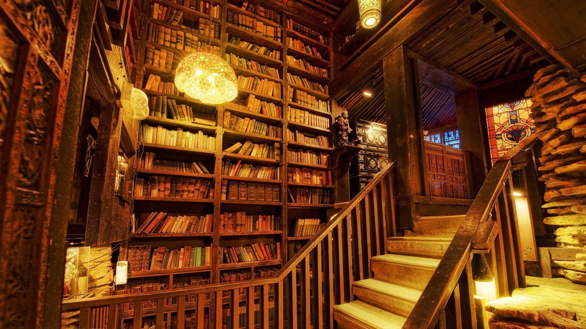
I think you’ll appreciate #ffcc66
#FF7700! I love this orange color and use it in all my tests.
I tend towards green.
Which one?
Sky green is best green.
#00FF00
Sear my eyes with beautiful perfect green.
As I wrote this, I didn’t read that it was about light… #fca4a4 sweet pink, kinda like salmon but more red on the Hue slider. I use it as my brand color! Even though I don’t really use it much.