I especially liked the part around 0:30 where the bike lane that was colored red for better visibility stopped being colored at the conflict point, which is the most important place for the color to be.
It’s… kind of justified: the red lane means “forbidden for cars to enter”, while the yellow slashed means “may enter, but forbidden to obstruct”. The fun part is how bikers have to go straight into the incoming traffic.
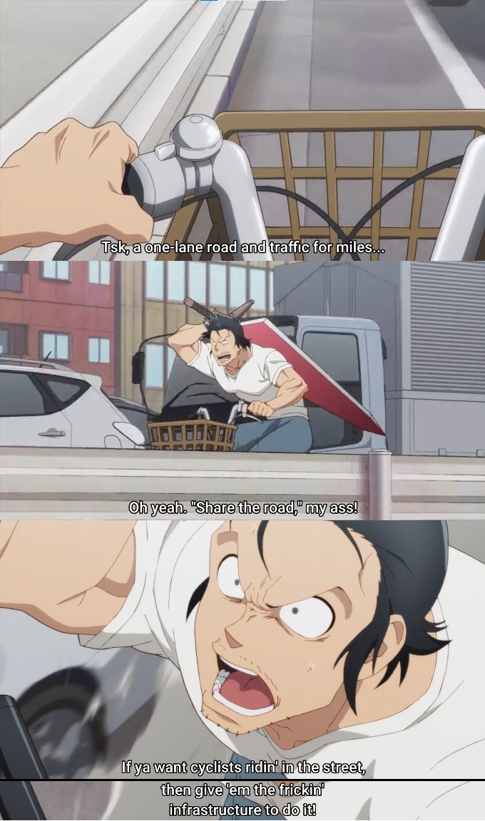
There are other funny infrastructures elsewhere, where the “bike lane” is painted in white right in the middle of the road, as in “let’s bikes and cars and buses share the same lane”… and then they put speed bumps on it. What could go wrong, right?
That’s a decent reference. I think, since in this case they’re painting the whole “bikes only” lanes, the conflict areas should use the dashed option.
Looking now through Google Earth, I’ve noticed some other bad places, like where the bike lane crosses some tram rails, with no sign of any kind at all.

We have a “special infrastructure” around here… we call it “guess from which way will they run you over”:
https://youtu.be/d8MQ0mkgYUM
I especially liked the part around 0:30 where the bike lane that was colored red for better visibility stopped being colored at the conflict point, which is the most important place for the color to be.
It’s… kind of justified: the red lane means “forbidden for cars to enter”, while the yellow slashed means “may enter, but forbidden to obstruct”. The fun part is how bikers have to go straight into the incoming traffic.
There are other funny infrastructures elsewhere, where the “bike lane” is painted in white right in the middle of the road, as in “let’s bikes and cars and buses share the same lane”… and then they put speed bumps on it. What could go wrong, right?
Yeah, I realized that after posting. Still, IMO it ought to be the other way around, like the top example here.
That’s a decent reference. I think, since in this case they’re painting the whole “bikes only” lanes, the conflict areas should use the dashed option.
Looking now through Google Earth, I’ve noticed some other bad places, like where the bike lane crosses some tram rails, with no sign of any kind at all.
On the bight side… it used to be even worse. 🤷