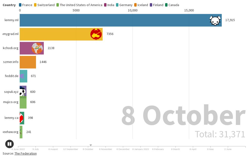
A timeline I created of the total users at the top 10 Lemmy instances as a bar chart race: https://public.flourish.studio/visualisation/14058992/ and as a line chart: https://public.flourish.studio/visualisation/14080522/.
Yeehaw Beehaw!
Wow beehaw really took off recently huh?
What this doesn’t show is active users, just total. For quite some time we’ve been one of the most active large instances. I don’t remember the exact timing, but we’ve held the spot of 3rd most active for some time, we just now have total users to match that.
Is there a time-series plot version of this? I always have difficulty really absorbing the data when it is animated like that.
deleted by creator
Is it possible to message on mastodon and peertube with lemmy (or is it only through kbin currently)? I was trying to figure out how that worked but had some difficulty
deleted by creator
Poked my head in to the AMA and it’s basically what I expected. To the surprise of no-one Spez is a tool and should go boil his ass.
Beeeeeeeeeeeeeeeeee HAAAAAAAAAAAAAAAAAAAAAAW!
My join request hasn’t been acknowledged yet and it’s been a couple of days :(
Ditto, I joined lemmy.world instead


